About the Project
During my first year of my Visual Communication B.A, we got an exercise to research an animal of our choice, and based on that animal, to create a visual identity for an imaginary company, which could be represented in theory by the animal we chose. Since a cheetah is one of my favorite wild animals, I knew in the very first second I'll choose it.
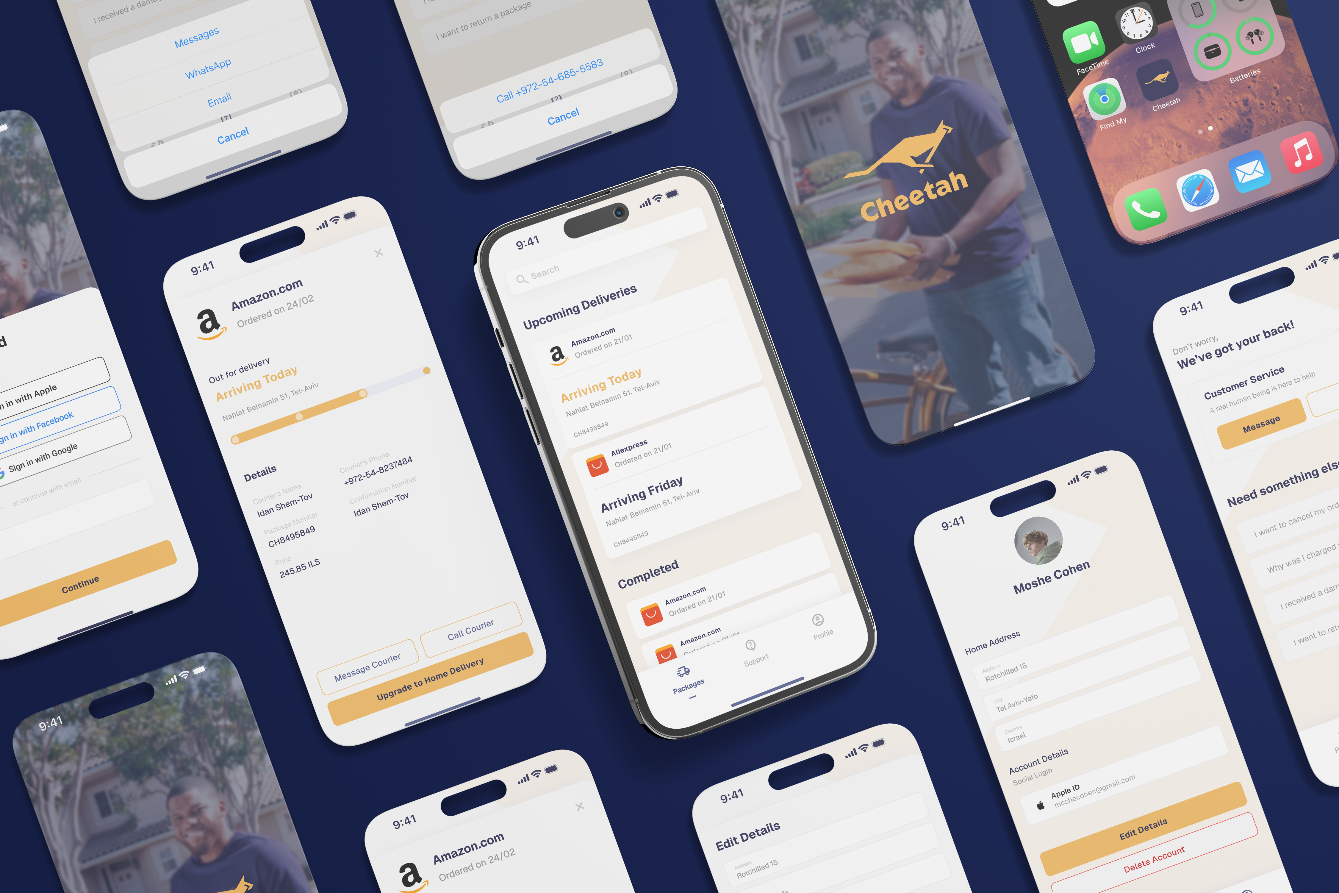
- Target Audience: Medium to large companies that require reliable, and fast services, in addition to individual shoppers from amazon, aliexpress etc.
- The Mission: To create a logo that reflects speed and trust, 2 values which are the fundamentals of the company.
- Creative Concept: Develop a visual identity by the cheetah characteristics, based on speed and trust.
This concept defines not only the look of the logo but also the tone and visual identity of the brand, including colors, typography, and applications across different mediums.
Visual Language

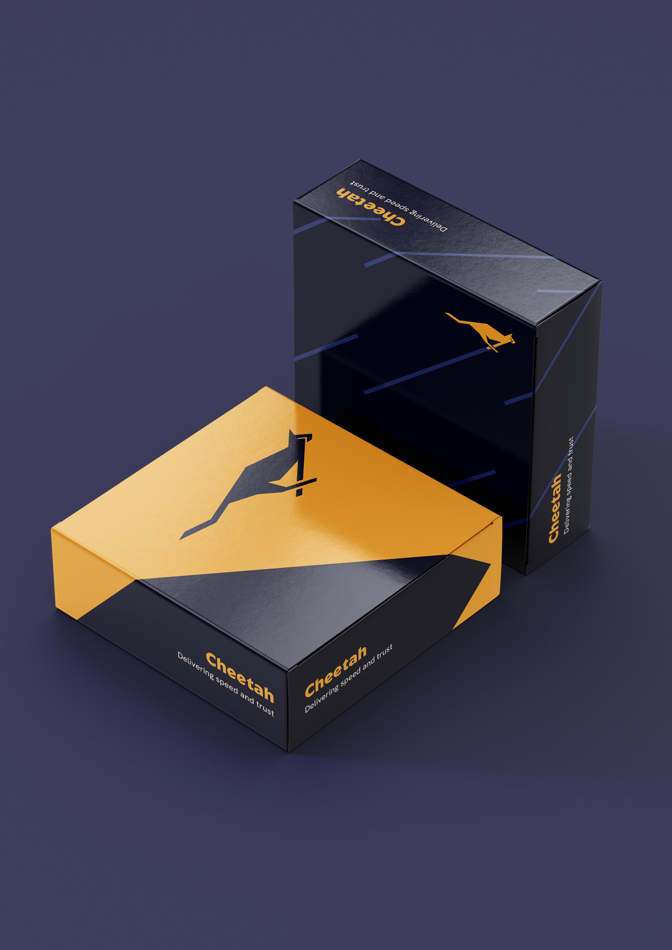
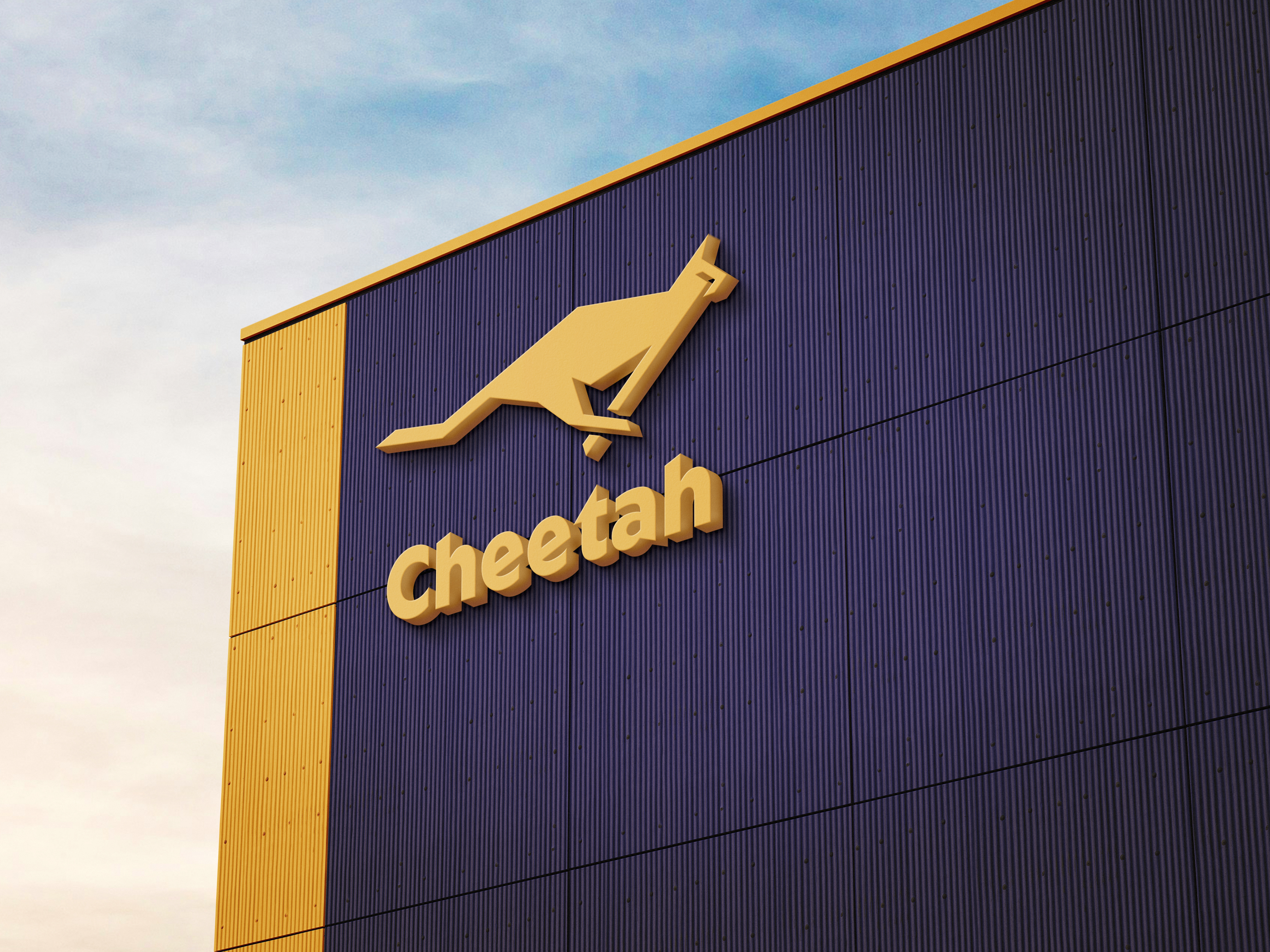
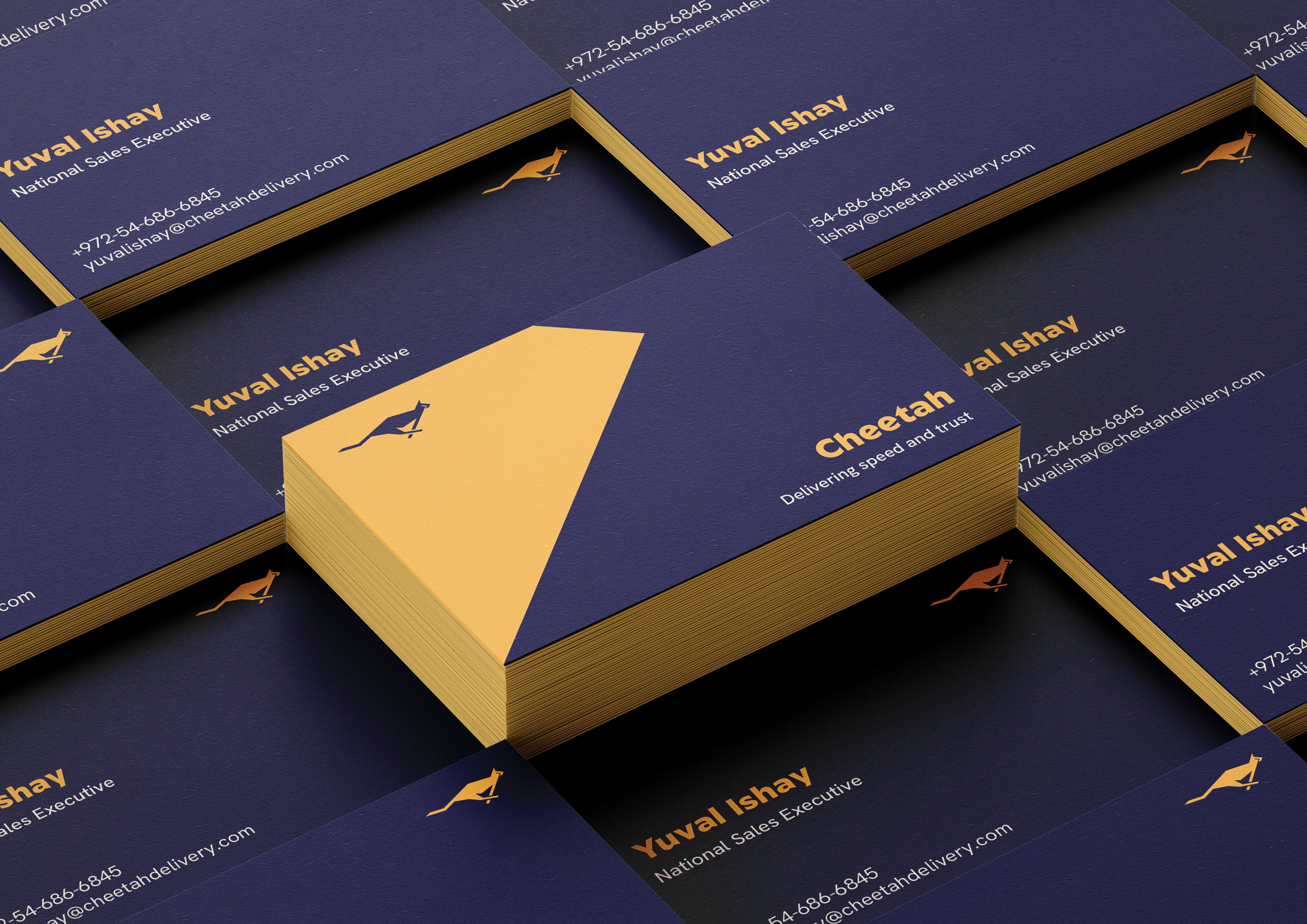
The Brandmark
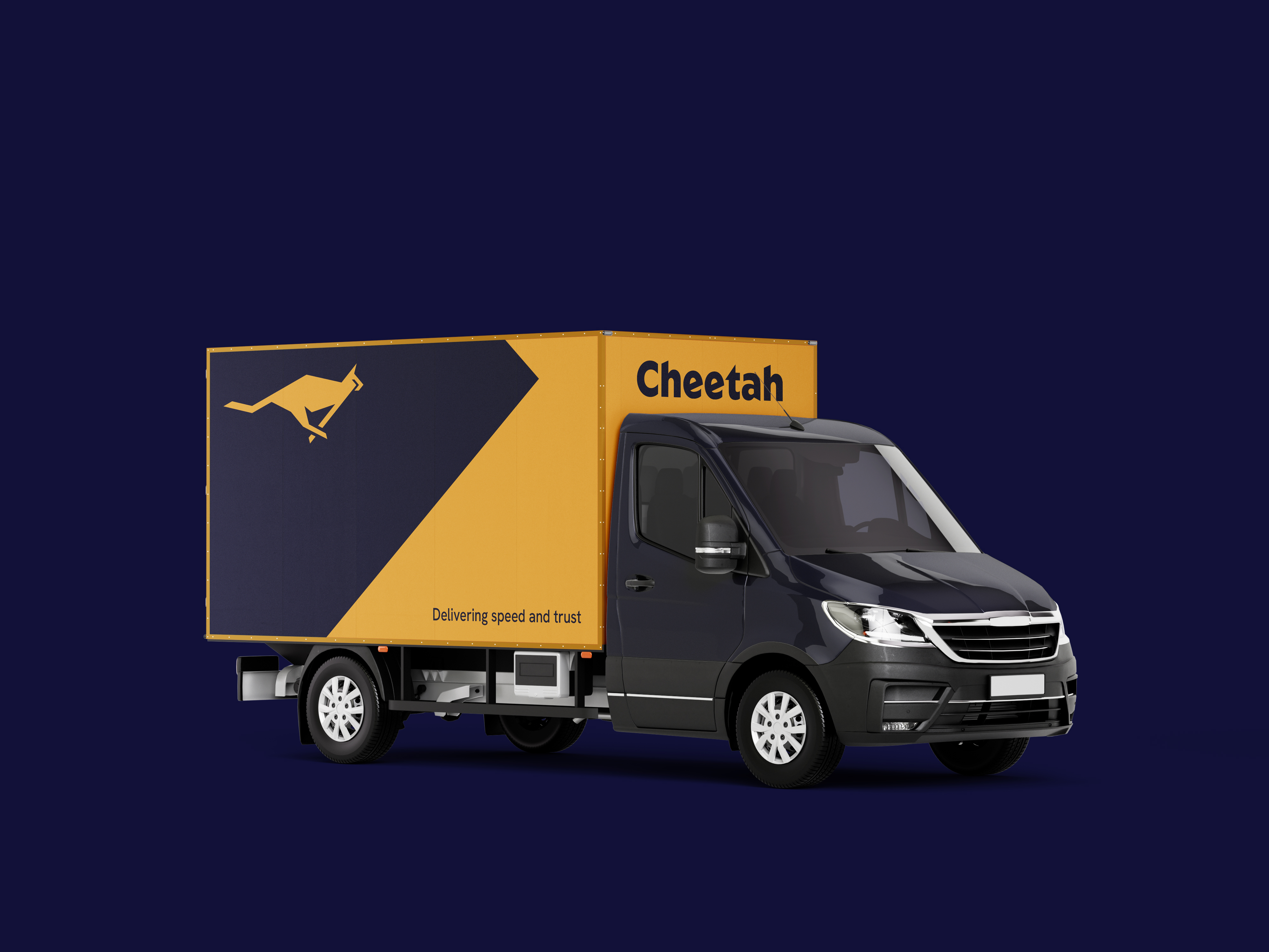
The brandmark is a cheetah, constructed using rectangular and sharp lines to emphasize speed and movement. The shape is designed with only four angles, creating a geometric and memorable form while ensuring consistency.

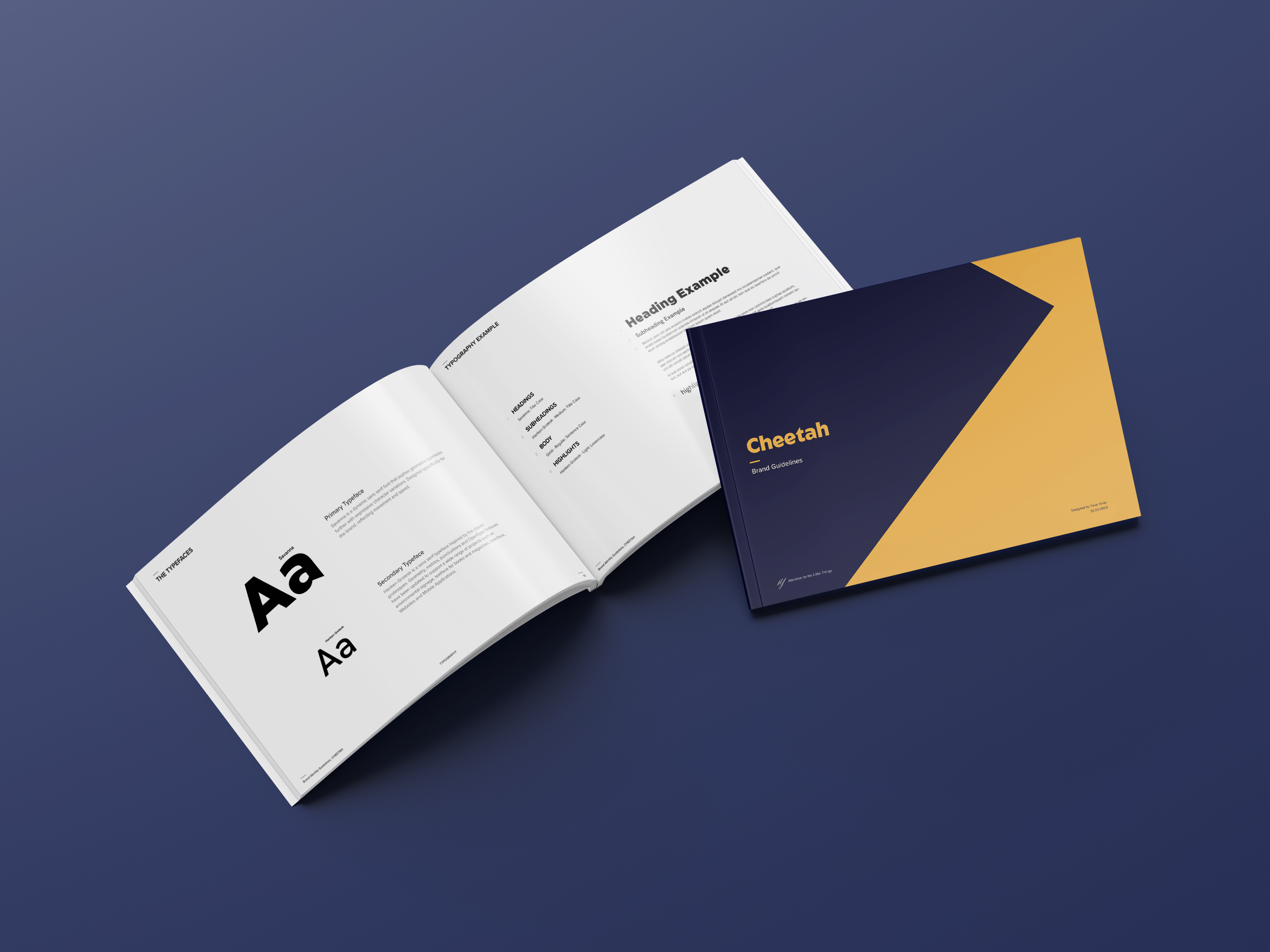
Typography
Savanna is a dynamic sans serif font that pushes geometric typefaces further with expressive character variations. Based on the characteristics of the font Geom, Savanna was designed specifically for the brand, reflecting movement and speed.

Color Palette
The selected color palette is based on the cheetah's colors, in addition to the blue color palette, which conveys trust.
The brand in action