February 2026
about the project
HITVisual Communication BA2nd YearTypography Studio
In this typography studio assignment, the task was to design a paged editorial format based on a long-form article. The goal was to utilize a structured grid and a robust typographic system to create an engaging reading experience across multiple spreads. For this project, I specifically selected an essay from the Tel Aviv Cinematheque exploring the automobile as a narrative space in film—a vehicle that actively drives the plot forward.
The Creative Process
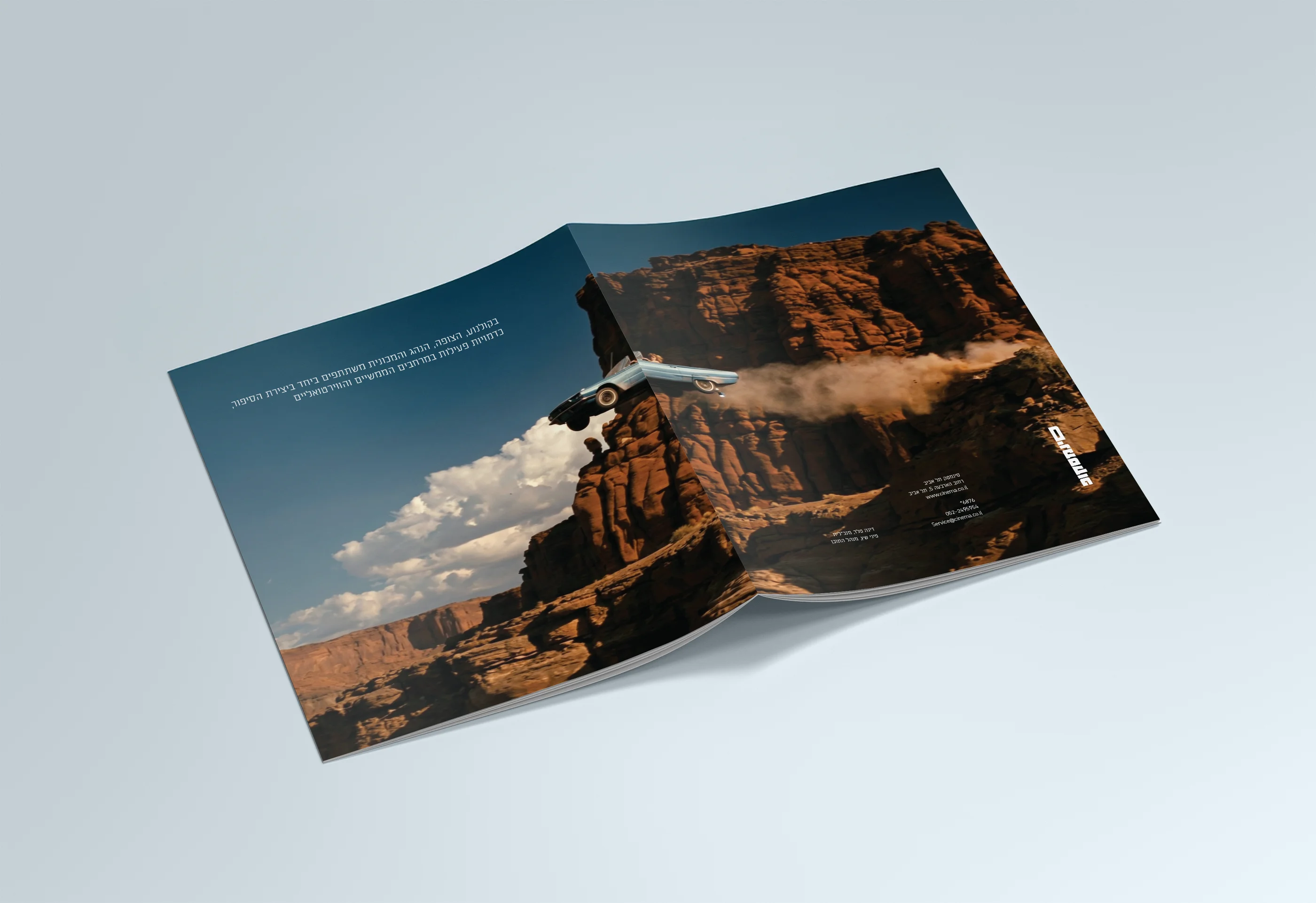
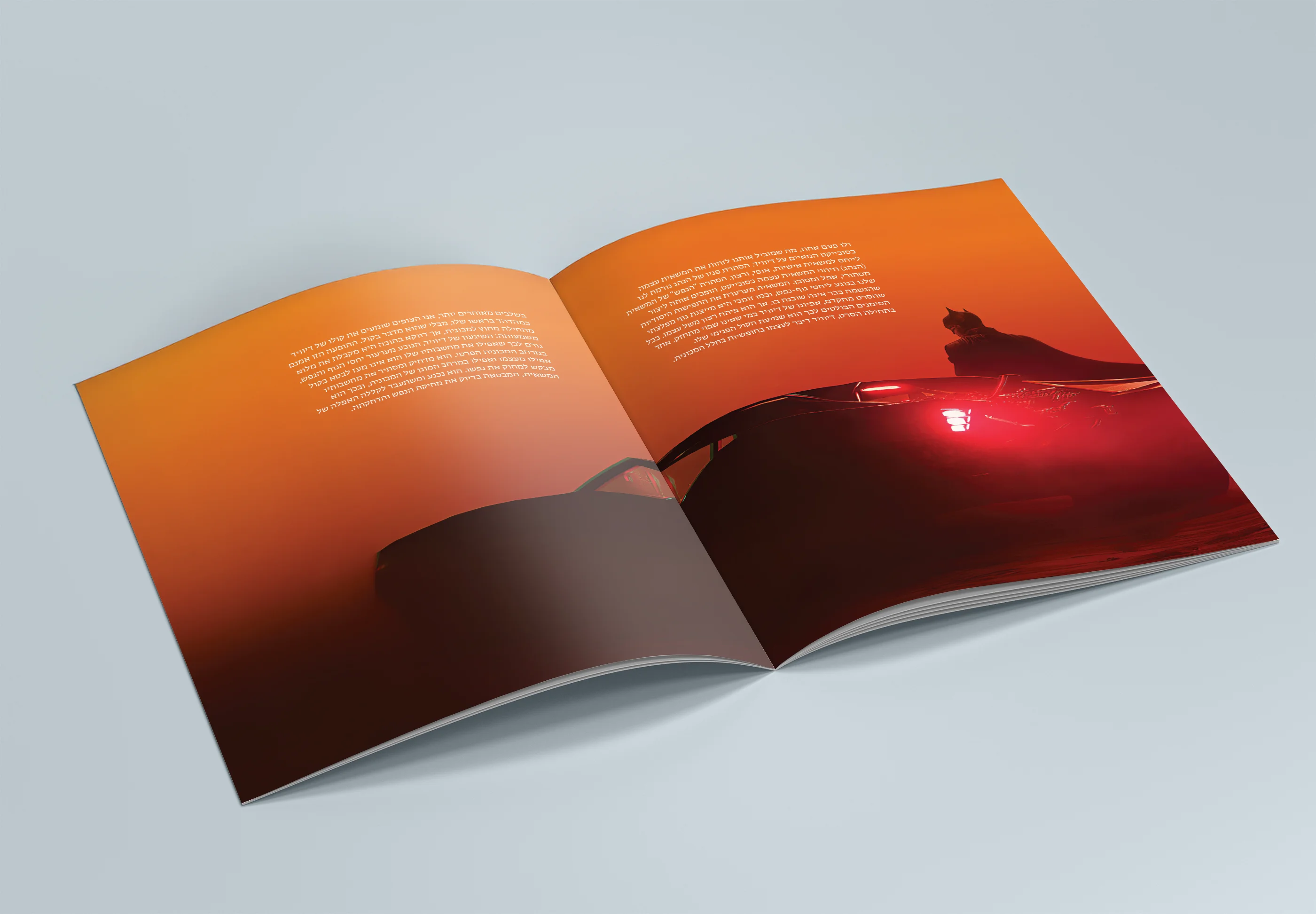
- The Concept: I approached the magazine's layout as a cinematic journey rather than a standard editorial piece. Rejecting conventional magazine tropes, the cover features no title or masthead. Instead, it relies solely on a climatic image of Thelma & Louise, physically directing the reader's eye to a single conceptual quote, forcing an active exploration.
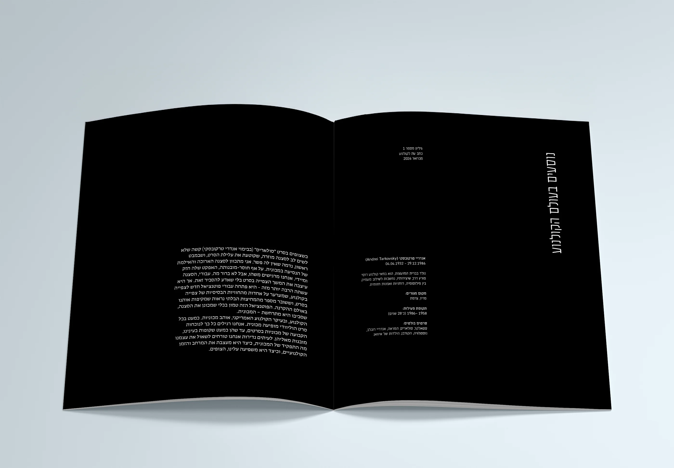
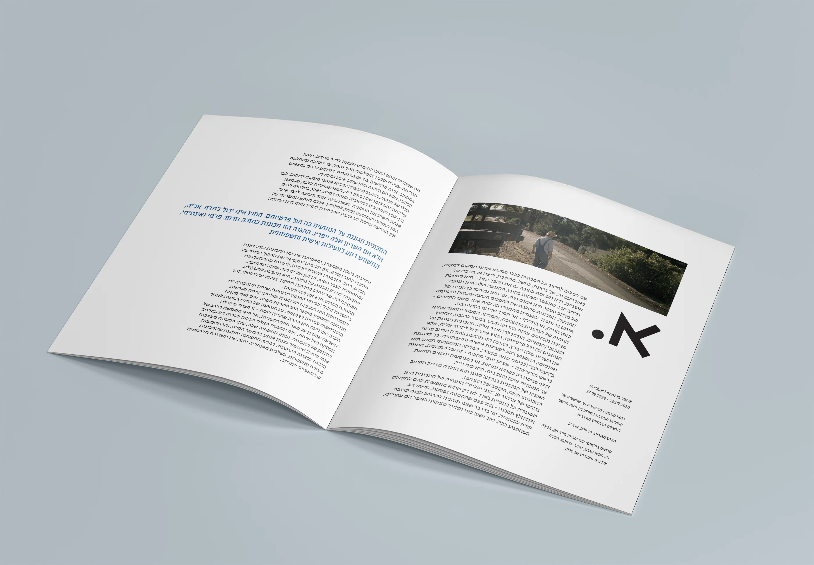
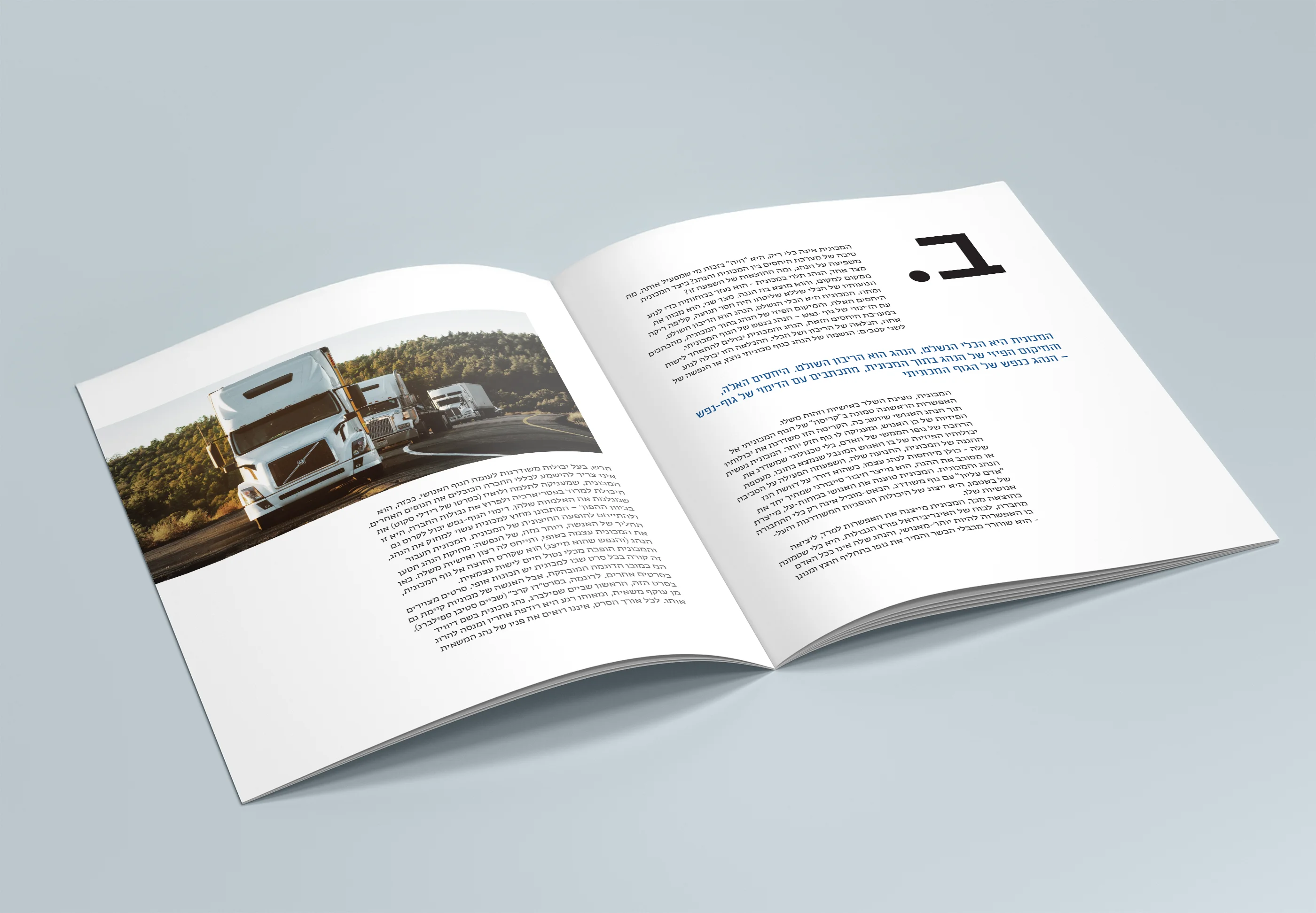
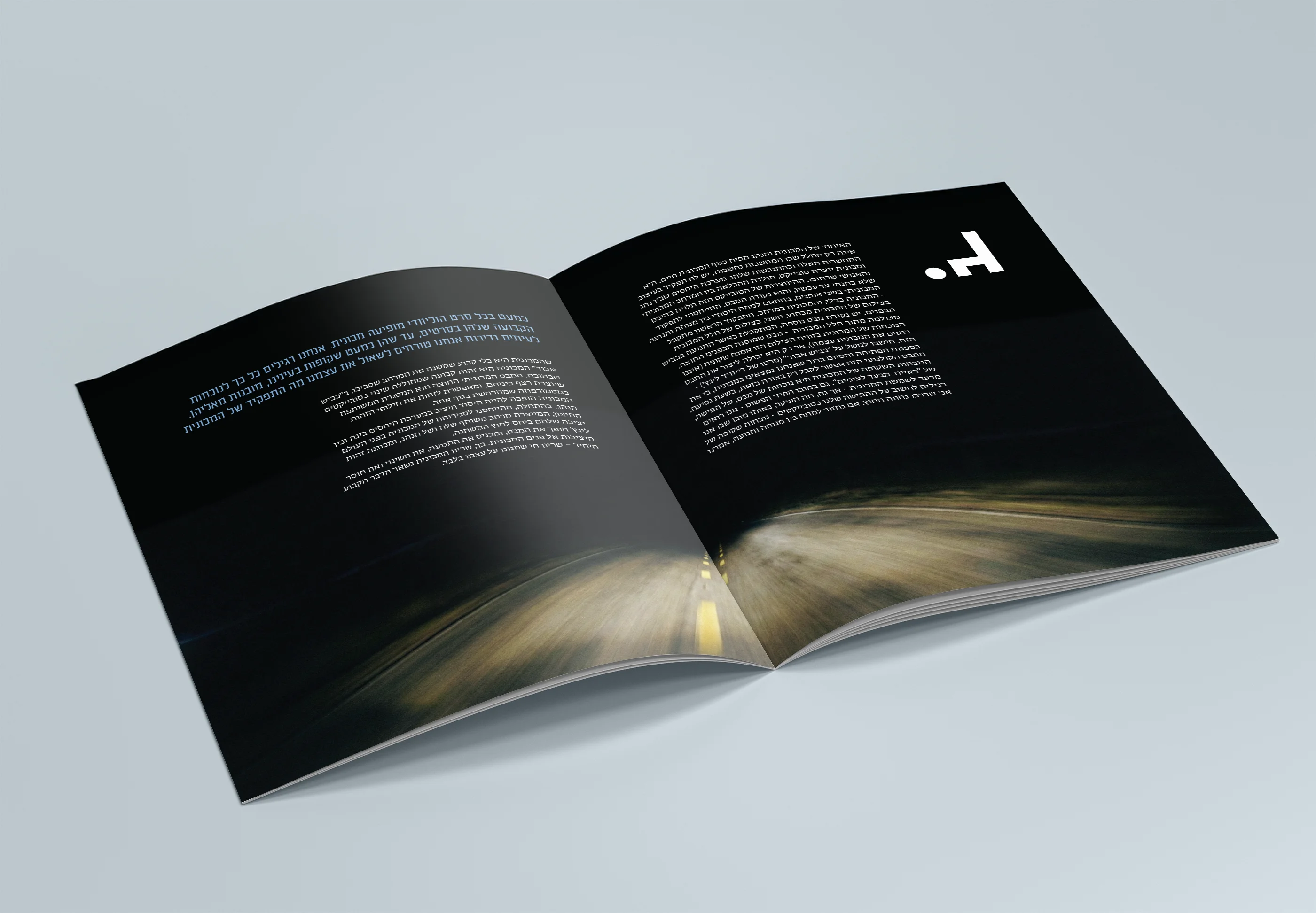
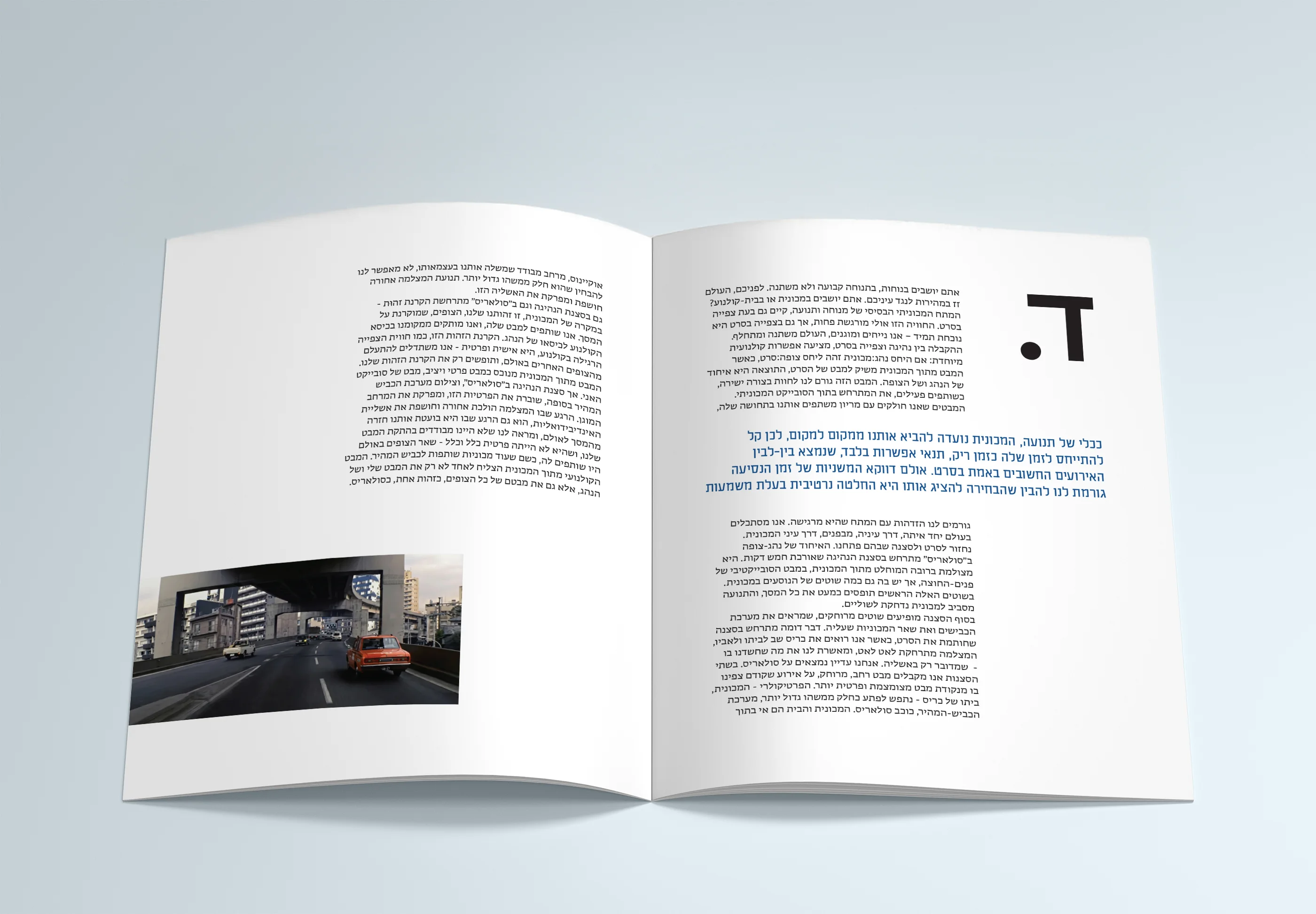
- The Pacing: The reading experience is designed to mirror film sequencing. The magazine opens with a pitch-black spread—a cinematic 'cold open'—before revealing the title and introductory text. Throughout the article, images are not merely decorative; they are rhythmically placed to serve as visual breaks that align exactly with narrative shifts in the essay.
- Typography: To emphasize the contrast between the mechanical subject matter and the cinematic storytelling, I built a system around two opposing typefaces. The headlines utilize a harsh, utilitarian highway-signage font (a nod to the road), which contrasts sharply with the classic, elegant serif font used for the body text. This creates a typographic tension that reflects the layered nature of films.