About the Project
During my first year studying Visual Communication, a friend from class and I discovered a shared obsession with Hebrew typography — and an ongoing debate about who was better at identifying fonts by sight. What started as a playful rivalry quickly turned into an idea for a game that could settle it once and for all.
That’s how Name the Font was born — a browser-based game that challenges players to recognize Hebrew typefaces used in our daily life, under time pressure. I led the UX/UI design and front-end development using the Next.js framework, crafting a clean, competitive experience that celebrates typography through play.
Wanna see for yourselves? Let's go! Grab your place at the leaderboards table!
Project Requirements Document
We started by sitting with my friend and deciding on the needed features for the MVP version: How users are gonna interact, the basic game logic, the all-around experience, the authentication, the competitive aspects and more:
Game Logic
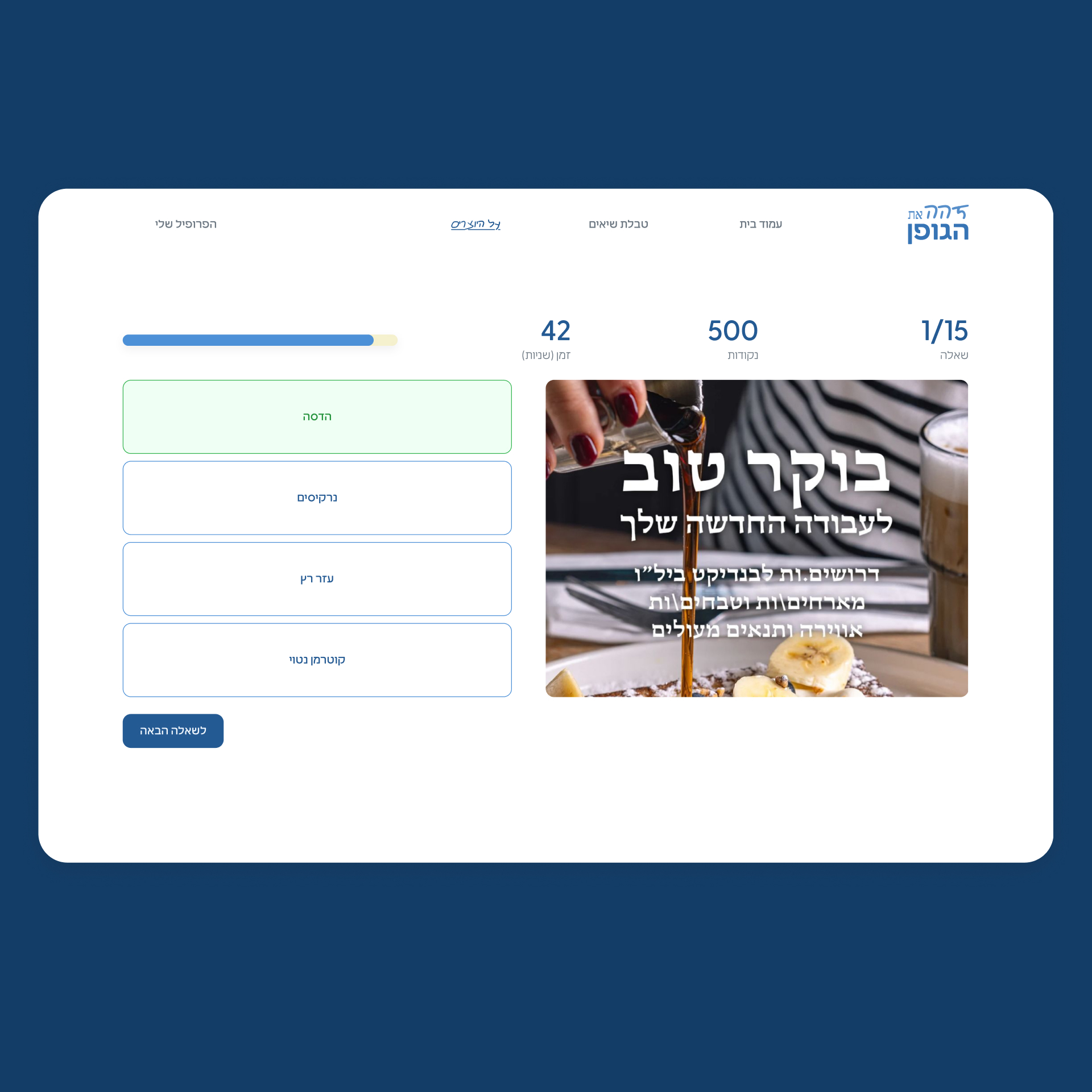
- 10 questions per round, because we wanted depth, but a continuous experience to discover more fonts.
- Time-based points, to add additional challenge to player who know a lot of fonts
- Motion Design using gamification principles, so the whole experience will fill alive.
Authentication
- Google-based social login, to disappear the need to remember yet another password.
- Magic-Link authentication, to cover the edge cases of those who don't have a google account.
- Combined sign-up and sign-in, to make everything at one place.
Leaderboards and Profile
- Personal profile page, with the relevant statistics about the player's performance, with weekly and all-time views.
- Leaderboards table with points based rankings with logic to rank properly in-case of a tie.
Once I had the PRD, I started designing the UI, not before creating user flows, and design guidelines the game needed.
User Interface
The UI was designed around the brand of name the font, which we designed together. This case study is available in the branding section of my portfolio. For now, here’s a glimpse of the final design:
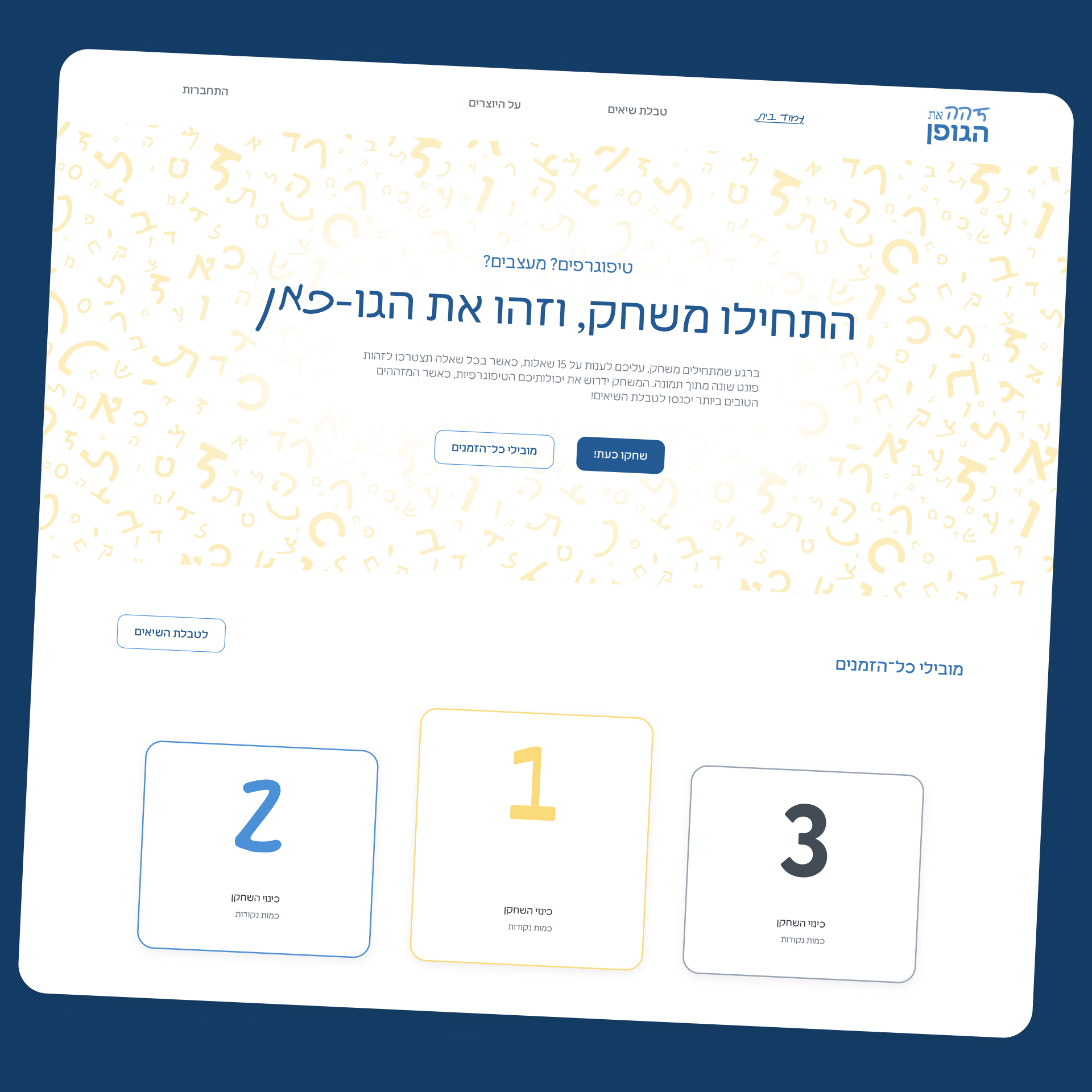
Landing page with a clear call-to-play
Homage to the top-ranked players
Rotating header to show different typefaces
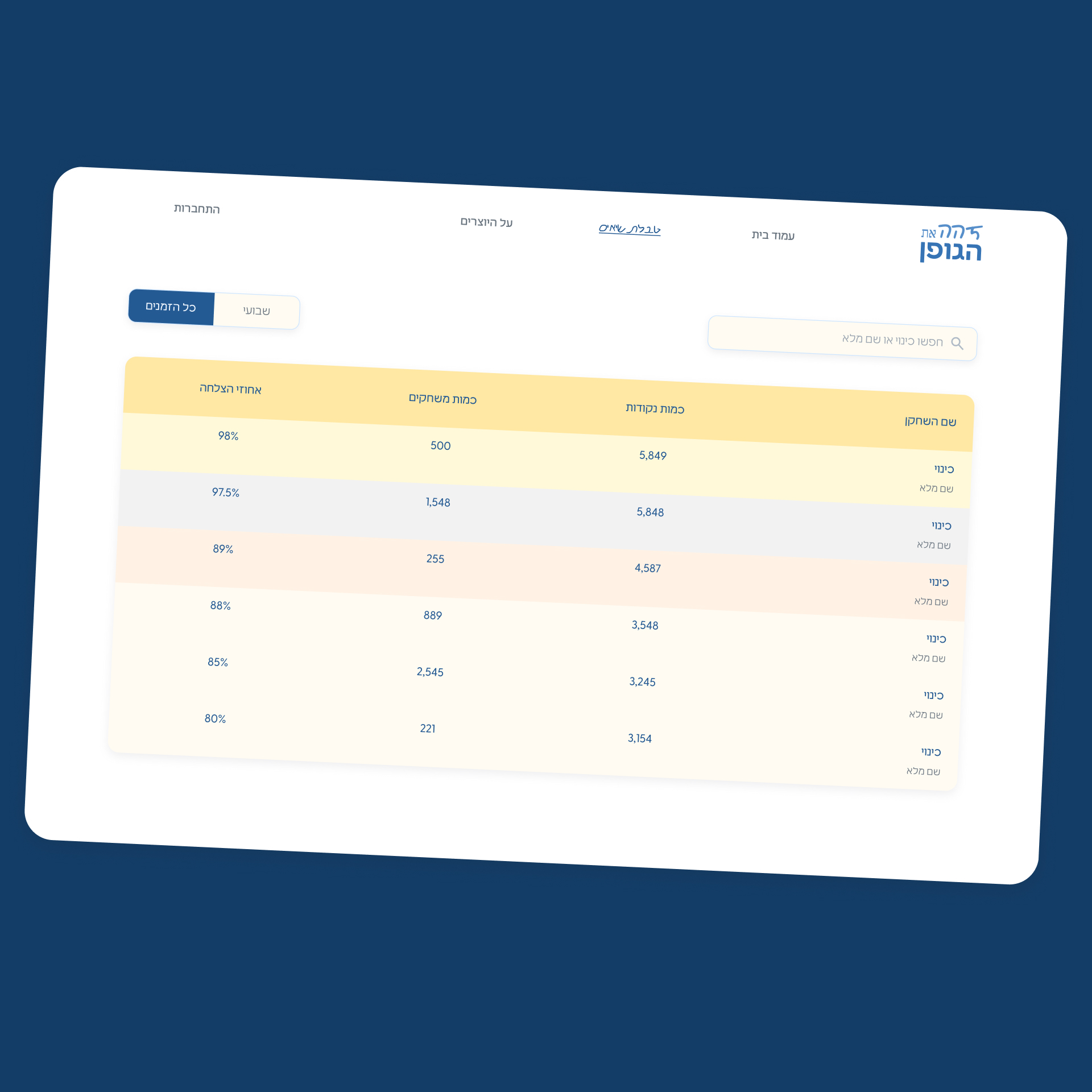
Clean table for scanning data fast
Search bar for easy filtering
Tabs to switch between all-times leaders or weekly leaders
visual difference between the top-3 and the rest of the players.
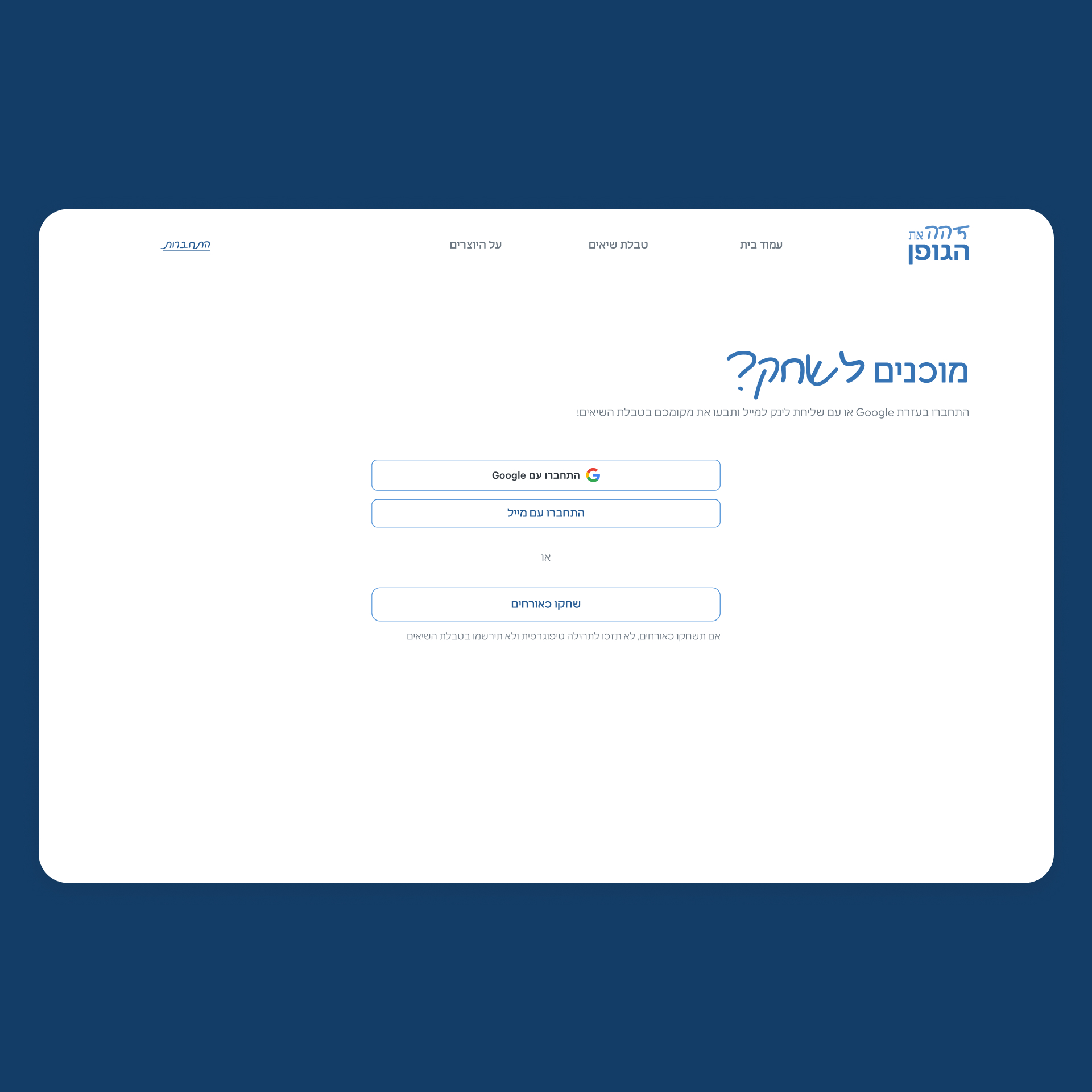
Combined sign-up and sign-in
Redirecting to this page, in-case a player starts a game as a guest
Google & Magic Link for a password-free experience