About the Project
Onyx is an in-organization team, responsible for creating the long-term strategy and working methods for their organization. Onyx is also responsible for the product of the company, as the team is built from product managers, QA's and product designers.
- Target Audience: Software teams within the organizations, as well as the company's clients, which are also technically and technologically oriented.
- The Mission: To achieve a sleek and modern logo, symbolizing the team's commitment to growing and evolving their product while collaborating with the rest of the organization's teams.
- Creative Concept: Using the onyx stone to establish a technological, elegant look, while providing the stability and sense of confidence in the brand.
The concept will be the source of the tone of the brand, as well as the looks, the feel and the entire visual identity, including the logo, the colors, the typography and the applications of the brand.
Visual Language

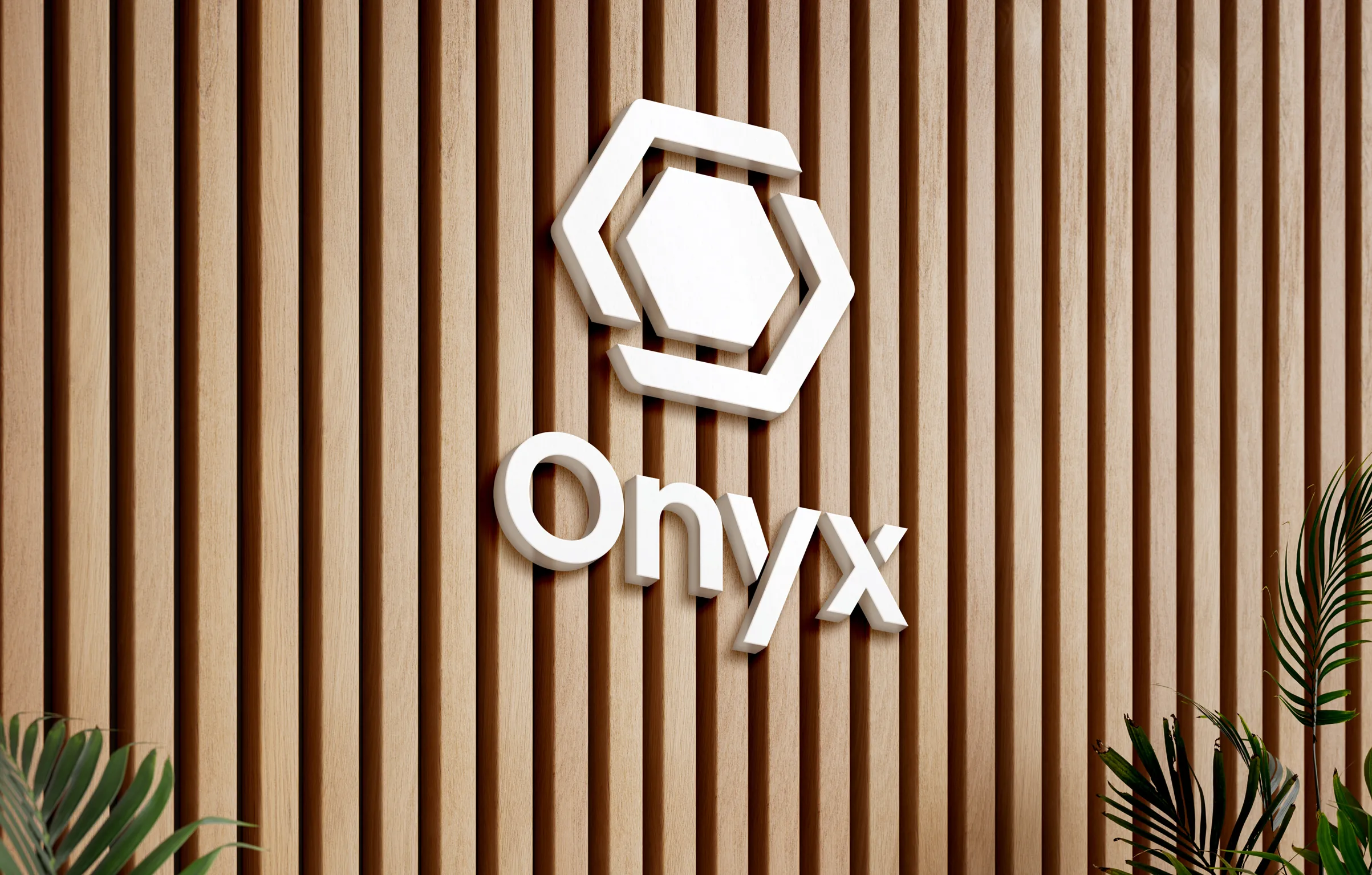
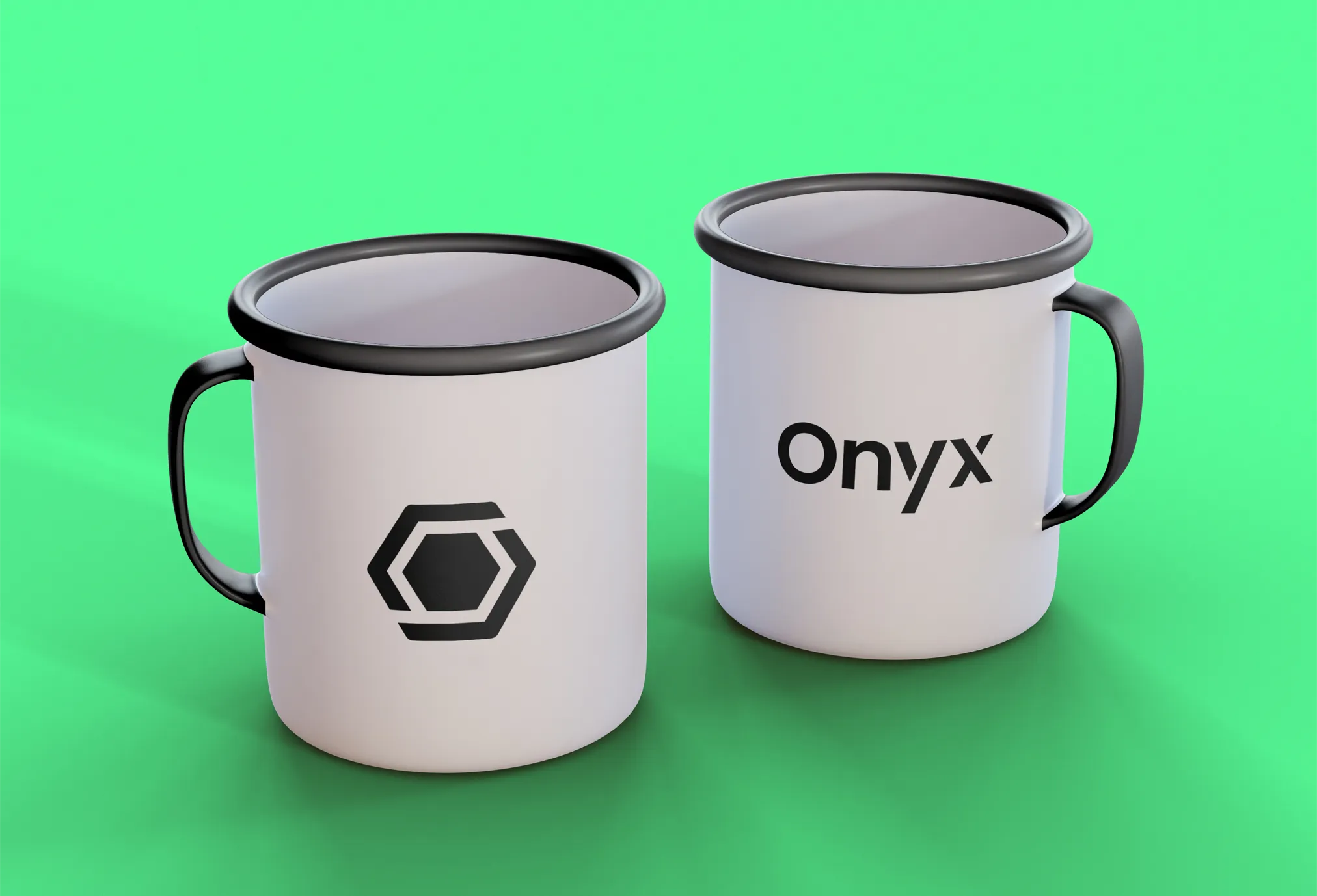
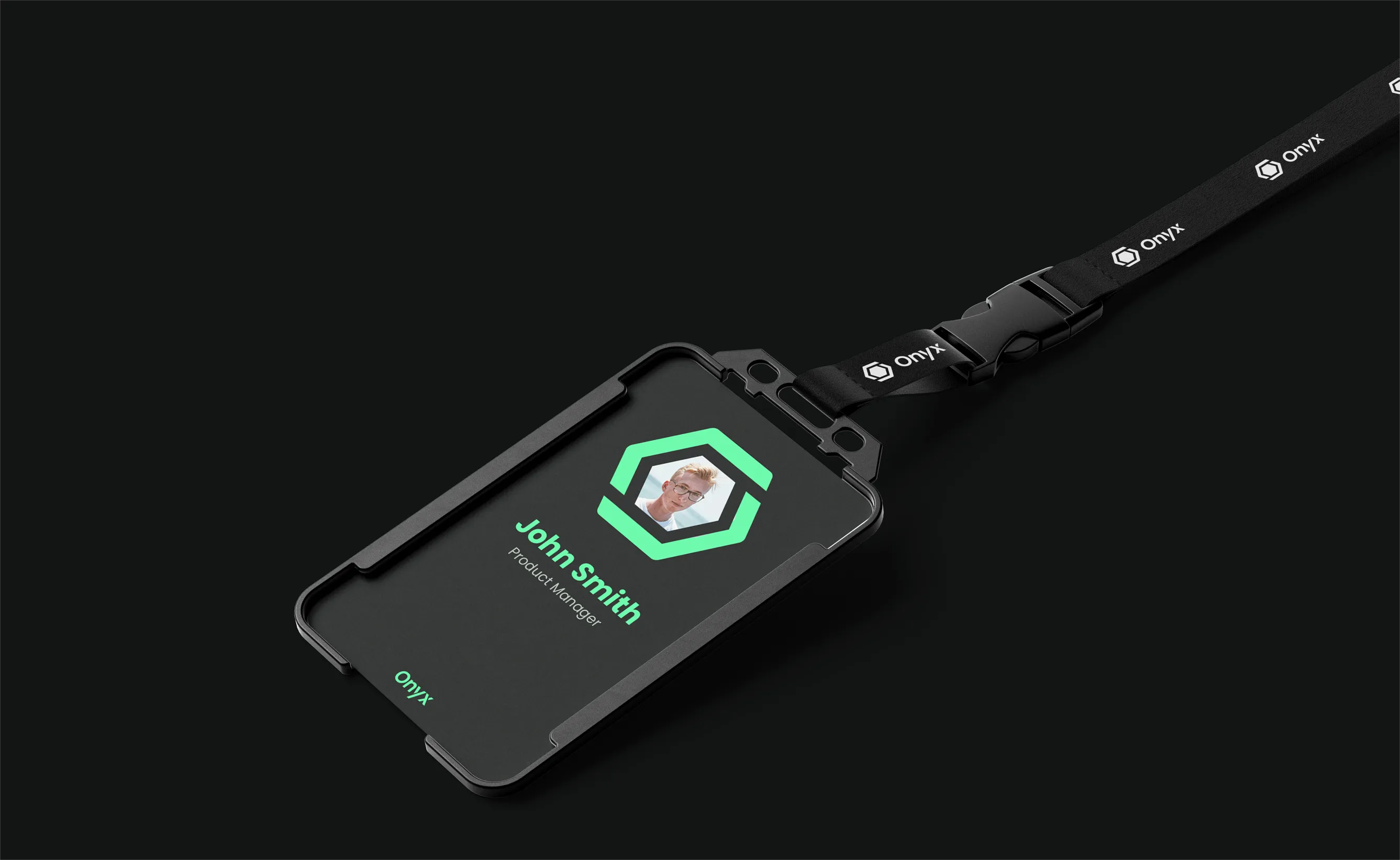
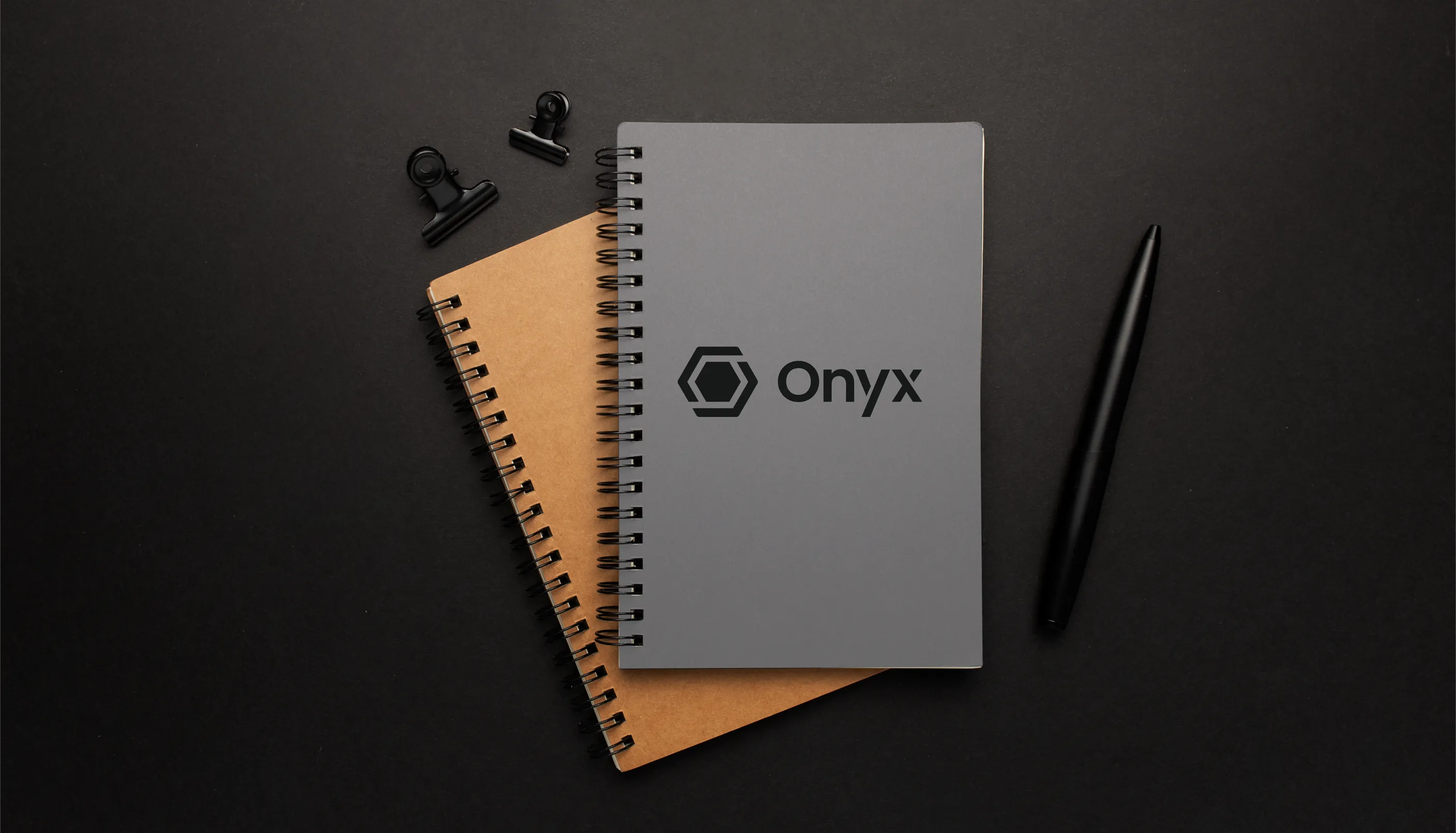
The Brandmark
Creating a visual identity inspired by the stability, elegance, and strong presence of the onyx stone. By removing two sections from the stone’s frame, the brandmark consists of two elements forming a single frame—symbolizing collaboration and teamwork. The negative space within the brandmark forms a path with two possible crossings, representing the versatility and out-of-the-box thinking essential for an excellent product team.

The Logotype
The logotype is based on the Poppins typeface, a clean sans-serif font. Paired with our brandmark and refined through a few visual adjustments, it results in a sleek, modern logo that resonates perfectly with the team’s target audience.

Color Palette
The brand’s color palette is based on the dark gray of the onyx stone, complemented by a bright mint green to symbolize growth and a fresh path forward for the organization.
The brand in action