About THE PROJECT
Unique Freight is a freight forwarding company specializing in providing end-to-end logistics solutions, including air and sea freight, customs brokerage, and tax payments. The company serves medium to large-sized businesses, offering dedicated and personalized service with a strong emphasis on client satisfaction. Their commitment to going the extra mile, alongside free consulting for regular clients, sets them apart in the industry.
• Target Audience: Medium to large companies that require reliable, customized freight forwarding and logistics services.
• The Mission: To create a logo that reflects Unique Freight’s promise of an end-to-end freighting experience tailored to each client’s needs—whether through air or sea—while embodying speed, flexibility, and exceptional service.
• Creative Concept: Incorporating elements of motion and fluidity to symbolize speed and flexibility, paired with a professional and trustworthy design language that conveys the company’s dedication to client satisfaction.
This concept defines not only the look of the logo but also the tone and visual identity of the brand, including colors, typography, and applications across different mediums.
Visual Language
The Brandmark
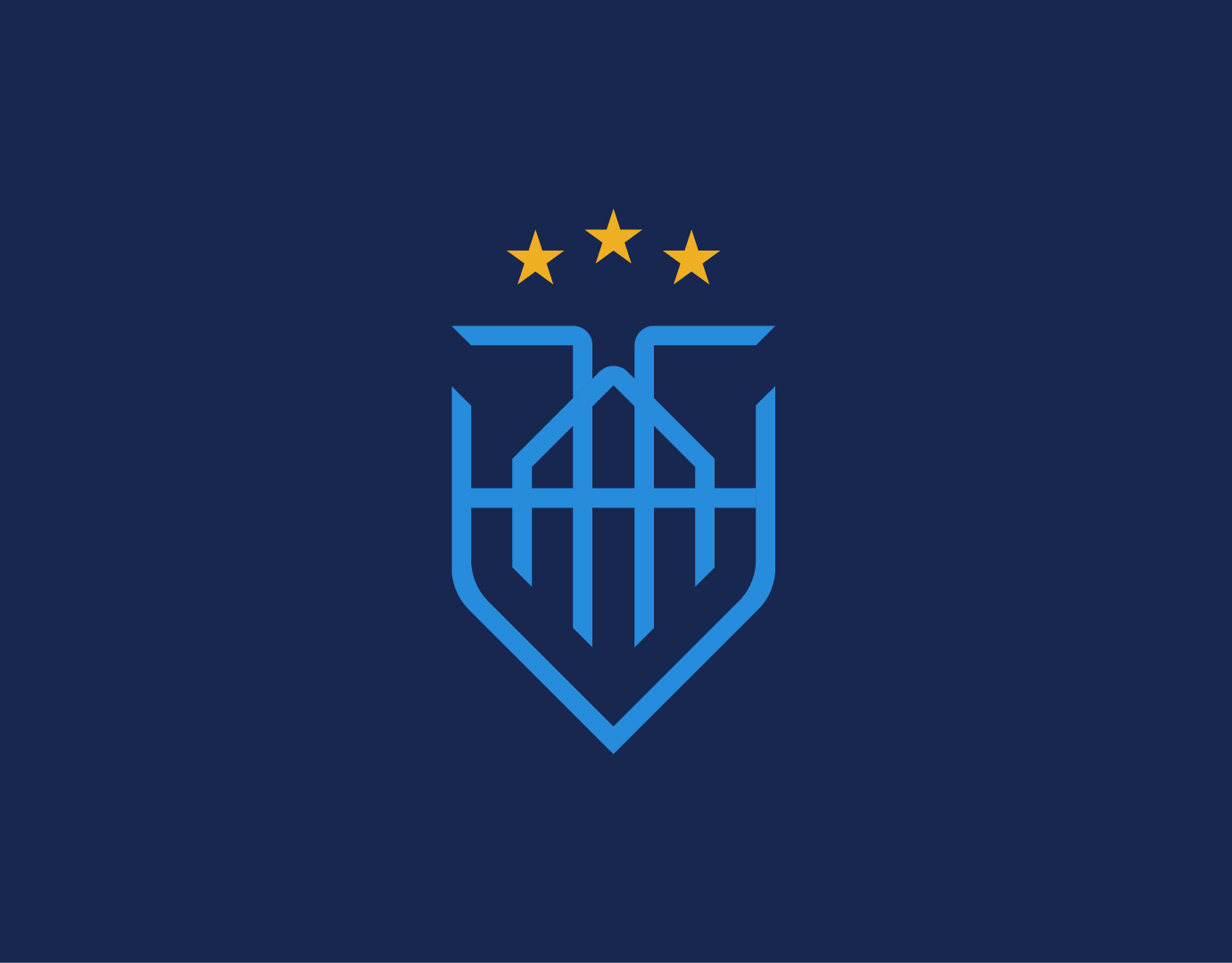
Using the initials of the company, U&F, is a great way to make your brand recognizable and build a strong connection with your target audience. Sharp angles and linework emphasize the commitment to speed and efficiency, while the diamond adds a touch of the company’s dedication to excellence. The intersection demonstrates the company’s ability to craft a flexible, unique experience tailored to clients’ needs, emphasizing the company’s commitment to excellent service.
Typography
Hanken Grotesk is a sans serif typeface inspired by the classic grotesques, with identical features to linear grotesk, yet available for commercial use. by modifing some letters of the font, such as the F and T, I was able to much the font to the brandmark and achieve the sense of speed.
Color Palette
The selected color palette combines deep blues and bold reds to balance trust, reliability, and authority with energy, passion, and boldness. The darker blues evoke stability, intelligence, and sophistication, reinforcing a sense of security and professionalism. In contrast, the reds introduce strength, warmth, and urgency, creating a dynamic visual presence that grabs attention while communicating confidence and vitality. Together, this palette reflects a brand identity that is both dependable and energetic, grounded yet forward-driven.
The Brand In Action
