About the Project
United Future Football Academy is a premier institution dedicated to cultivating young soccer talent and instilling a deep love for the game. It stands out for its comprehensive approach to player development, combining physical training, tactical knowledge, and mental resilience. The academy is committed to shaping well-rounded athletes who excel on the pitch and demonstrate integrity off it.
This project is a part of my ChatGPT challenge, in which I design a comprehensive visual identity according to the briefs provided by the Chat :)
• Target Audience: Young soccer enthusiasts aged 8-18 eager to develop their skills, as well as their parents seeking a reputable academy for their children. The academy also appeals to soccer coaches, local sports communities, and potential sponsors interested in supporting youth sports.
• The Mission: To create a design that reflects the area of the academy in an innovative and futuristic way, which will establish trust and professionalism in the market. Although I was aiming for a futuristic look, I also wanted to design a timeless logo, a one that’s gonna become traditional over time, while unitying the community behind it.
• Creative Concept: Incorporating a house and a shield to symbolize strength and a home-like feeling, paired with a design language that conveys the academy's dedication to unity, friendship and excellence both on and outside the pitch.
This concept defines not only the look of the logo but also the tone and visual identity of the brand, including colors, typography, and applications across different mediums.
Visual Language
The Brandmark
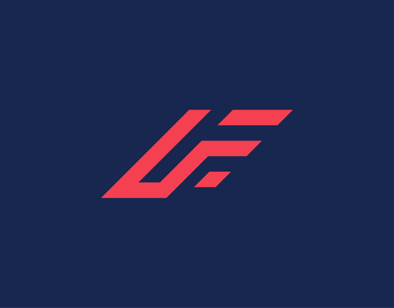
The logo combines the initials UFFA in an abstract way, giving it a timeless, traditional feel. The 'A' suggests a house and the 'U' a shield, symbolizing unity and community values. Three stars highlight the academy’s drive to excel, improve, and win with modern methods.
Color Palette
The palette was chosen to balance trust and energy. Dark navy and teal convey stability for parents and coaches, while bright blue adds youthful energy. Golden yellow highlights ambition and achievement, making the brand both approachable for players and reliable for the wider community.
The Pattern
The brand pattern is built from the abstract shapes of the logo, repeating the house form to create a strong and recognizable visual texture. Its geometric rhythm conveys structure and unity. This pattern extends the identity beyond the logo, giving the academy a consistent and memorable presence across applications.
The Brand In Action
